Sol LeWitt
- Sol LeWitt
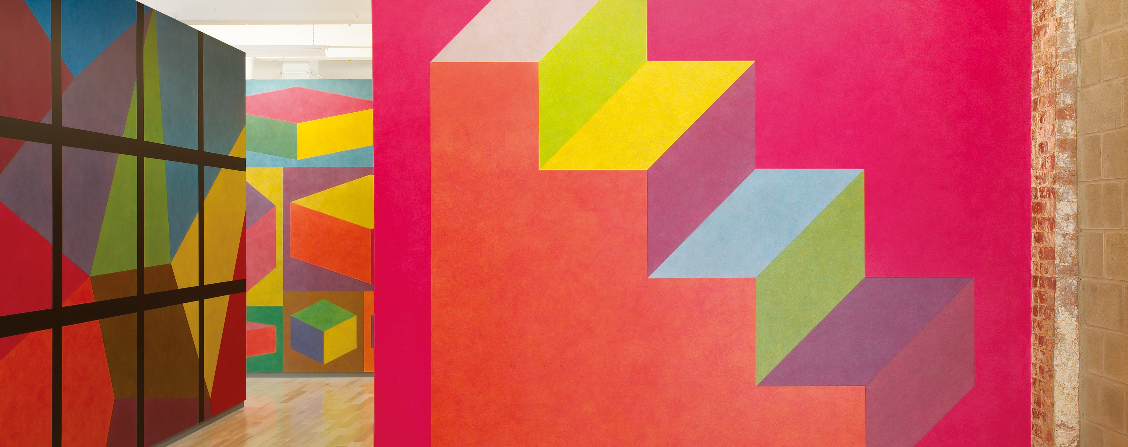
Isometric figure with color ink washes superimposed.
June 1989
Color ink wash
Yale University Art Gallery
Gift of the LeWitt Collection, Chester, Connecticut, in honor of Suzanne Hellmuth and Jock Reynolds
First Installation
Fundacio Joan Miró, Barcelona
First Drawn By
David Higginbotham, Elizabeth Sacre
MASS MoCA Building 7
Second Floor
Wall Drawing 610 was first drafted in the late 1980s, during the period of Sol LeWitt’s career in which he was creating ink wash wall drawings featuring isometric forms. This staircase-like isometric figure implies volume, canted as it is towards the viewer, yet does not imply linear recession. The base and left-hand edge of the figure are parallel with the edges of the wall, acknowledging flatness, and the steps are angled, revealing additional faces to the prism without implying depth. This uneven and non-illusionistic method of implying three-dimensionality has several precedents in art history, such as the intuitive perspective used by Egyptian relief sculptors, and the tilted perspective that appears in early Renaissance panel painting and frescoes.
This wall drawing is also an interesting example of LeWitt’s technique of superimposing ink washes in order to create colors and tones. The background is in his primary red, and the foremost panel on the figure is orange: equal parts red and yellow ink. The steps are composed of a series of parallelograms, colored using different layers of ink washes. The specific color of each shape within the figure is indicated in the title for this wall drawing. In order to describe each tone, LeWitt uses a system of letters to indicate the color of each layer and the order in which they are to be applied. For instance, the orange panel is described as R, Y, Y, R. Literally: a layer of red ink, two layers of yellow, followed by a final layer of red. The B in his instructions indicates blue ink, and the G indicates grey.
Backstory
The formula for the ink washes has been changed recently to a mixture of acrylic paint and water, resulting in a more vibrant set of primary colors than is in evidence in earlier installations of these ink drawings. The red background for Wall Drawing 610 calls for three layers of red, one of the most saturated incidents of this hue. The result is reminiscent of a fresco after cleaning; for years the Brancacci Chapel in Florence had been described as an example of master fresco painter Masaccio’s use of dense shadow and muted colors. A recent cleaning of the chapel, however, has revealed that the frescoes were actually executed in bright and luminous pastels. In this wall drawing, the brightness of the coloration differs slightly from previous installations, producing a fresh and exuberant comment on LeWitt’s interest in tonality and hue.


